By the Exhibition Stall Design editorial team · Updated 1 October 2026 · 9 min read
Short answer
Good trade show booths ideas are not styles, they are mechanisms. Height, brightness and a five-word message get you noticed from down the aisle. Movement — a running product, a timed demonstration, something a visitor can handle — is what makes them stop. Seating, charging and refreshment are what keep the conversation going past a minute. A screened meeting corner and lead capture held at the demo point are what convert it. Test every idea against which of those four it does, and drop the ones that only photograph well.
Key takeaways
- Lighting is the most under-budgeted element with the largest visible effect — hall lighting is designed for circulation, not for your product.
- Height and light buy distance. One message of five words or fewer buys comprehension. Everything else happens after the visitor has already walked over.
- Movement beats looks. A working product, a timed demo or something to handle will stop more people than any amount of finish.
- Staff position is an idea too, and it is free: a team along the open edge reads as a barrier, and the same team inside the stand reads as an invitation.
- Sort every idea by the visitor action it causes: seen, stopped, stayed, converted. An idea that causes none of the four is decoration.
- Ideas are size-dependent. A meeting table is the right idea at 36 sq.m and the wrong idea at 9 sq.m, where it eats the only floor you have.
What every good idea on a stand is actually for
Booths engineered to generate leads at B2B trade shows: demo zones, meeting tables and strong sightlines.
Most idea lists are lists of adjectives — premium, immersive, striking. They are hard to brief and impossible to price. A more useful way to generate trade show booths ideas is to work backwards from the four things that have to happen in sequence before an enquiry exists, each a separate design problem with its own tools. The sequence matters because effort spent out of order is wasted: a seated lounge is worthless if nobody could read your name from twenty metres away, and a brand tower is worthless if the visitor who walks over finds a table of brochures and nobody free to talk.
01
1. Get seen
Distance first. Everything at eye level is hidden by people, so visibility is bought with height, light and a message that survives being read at walking pace.
02
2. Get stopped
Interruption is a separate problem from visibility. Tools: anything in motion, anything running, anything a stranger can touch without asking permission.
03
3. Get them to stay
A conversation needs a body that is comfortable. Tools: seating of any kind, a bag shelf, power, refreshment, and a team member who is free when the visitor arrives.
04
4. Get the enquiry
The conversion has to happen on the stand. Tools: capture at the demo counter, a screened place to sit, and a named next step the visitor can picture.
Being registered from down the aisle
Distance is won in a room designed to defeat it. Hall lighting is uniform, eye level is a wall of shoulders and bags, and every stand around you is making a noise. Height, brightness and brevity are the three tools that still function in those conditions; everything else is only visible once a visitor is already close.
Of the three, height is the bargain, and most exhibitors leave it on the table. The manual often allows four metres or more and the stand gets built to two and a half, out of habit. Everything above about 2.4 metres exists only to be seen from far away, which means it can be the cheapest part of the build: nobody will ever inspect its finish.
The message costs nothing and is the hardest thing to get agreed. One line, five words at most, high enough to clear a crowd, in a colour that fights the panel behind it. A logo alone fails this test: it identifies you to people who already know you and says nothing to the buyer deciding whether you are worth three minutes.
- Backlit fabric or acrylic instead of flat printed panels, so the graphic emits light rather than absorbing it
- Contrast with your immediate neighbours rather than with the brand book: dark beside bright, plain beside busy
- A hero product lit like a showroom piece, with the rest of the stand deliberately dimmer
- A single saturated brand colour across a large plane, which reads from further away than any amount of detail
- Your name repeated on the fascia at both ends, so it survives whichever direction a visitor approaches from
- One headline of five words or fewer at 2 metres or above, where a crowd cannot block it
Winning the stop: movement, demonstration and something to hold
The stop is a separate design problem from visibility, and it is solved with activity rather than with finish. A machine running, a process happening, a screen that is clearly live — these interrupt a walk in a way that a beautiful wall does not. Where the product itself cannot be at the show, a cutaway or a material sample does most of the work, and it has the advantage of being something a visitor has to come inside to touch.
A published demo time is one of the cheapest ideas available and one of the most reliable. It creates small audiences instead of one-to-one conversations, it lets your team invite rather than intercept, and it hands you a legitimate reason to take a visitor's details — they want to know when the next one starts, or they want the recording.
- Something to pick up: a sample, a cutaway, a material board, a component with a real weight to it
- The product running, not the product displayed — motion, sound or output a passer-by can register from the aisle
- A before-and-after pairing, which explains a benefit faster than any sentence on a wall
- A small competitive element — a timed task, a guess, a scoreboard — that gives strangers a reason to talk to you
- A single open question painted at eye level, answered by whoever is standing at the counter
- A configurator or touchscreen that answers the one question buyers always ask about your category
A working product beats a photograph of it. A person demonstrating beats a video of a person demonstrating.
Ideas that make people stay long enough to talk
The commonest reason a promising visitor leaves in forty seconds is that the stand gives them nothing to do with their body. They are standing, holding a bag and a phone, in a loud room, being talked at. Give them somewhere to put the bag, somewhere to sit and a reason to stay, and the same conversation runs five minutes instead of forty seconds.
Of everything on this page, seating is cut first and missed most. A lounge is not required: two stools and a standing-height ledge take almost no floor and change every conversation held at them. Charging is the same kind of bargain, especially on the second afternoon when every phone in the hall is dead. If you add refreshment, face the counter into the stand — on the perimeter it builds a wall of backs across your own entrance.
- A quiet corner with a low table, screened from the aisle on at least one side
- One staff member deliberately unassigned, free to talk to whoever arrives while the rest are occupied
- Labelled charging points, with the common cable types already attached
- Water, tea or coffee from a counter that faces inward, so the queue stands in your stand and not across its mouth
- A bag shelf or hooks under the counter, so visitors are not holding everything they own
- A wall of real customer applications — the product in use, which people read far longer than they read claims
Winning the enquiry: capture at the demo, meetings off the floor
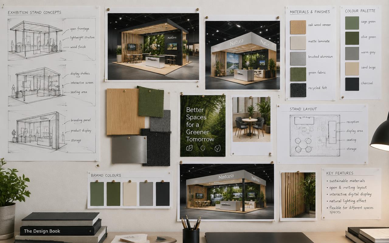
Measured properly, success here is a stall layout with a clear entry, a working demo counter, storage that keeps the floor clean, and a closed meeting area for serious buyers. Most stands that fail do not fail at attention; they fail at this last step, and the symptom is a busy show followed by a thin list of names.
Three decisions do most of the work here and only one of them costs money. Capture belongs at the demo counter, at the moment of interest. Meetings belong off the main floor, screened on at least one side, so a serious conversation is not held in the middle of the traffic. And staff belong inside the stand: a line of people along the open edge is the most common self-inflicted barrier on a show floor.
- A printed one-pager the visitor can photograph, instead of a brochure they will leave in a taxi
- A visible calendar or slot sheet, so a meeting can be booked for later in the show while interest is live
- A same-day lead review at the end of each show day, while the notes still mean something
- A meeting corner screened on one or two sides, with a table low enough to feel informal
- Qualification in two questions, agreed before the show, so the team can tell a buyer from a browser quickly
- Follow-up inside 48 hours, from a person the visitor actually met, not from a generic mailbox
Lighting, because it is still the most under-budgeted line
Venue lighting exists so that nobody trips over a cable. It is uniform, cold and comes from directly above, and under it an unlit stand looks like storage. Spend here before spending on finish: the cheapest way to make joinery look expensive is to light it, and the fastest way to waste joinery is not to.
Plan it in three layers: an ambient layer that lifts the stand above the surrounding hall, an accent layer several times brighter on the hero product and the brand wall, and a task layer at counters and tables where people have to read. The common failure is a stand with only an accidental version of the third, inherited from whatever fittings the organiser provided.
In practice we work to one spot per 1.5 running metres of graphic wall, choose warm lamps for anything with people or materials in frame and neutral for technical products, and aim the whole rig in the workshop rather than on site. A backlit panel beats a front-lit one wherever the budget allows, because nothing stands between the light and the graphic — including the visitor.
- Nothing lit evenly: pick what matters and leave the rest a stop darker so there is somewhere for the eye to land
- Spare lamps and drivers in the storage cupboard, because a dead spot on the hero product is the one failure visitors notice
- Backlit fabric for the main brand panel, so there is no hotspot and no visitor shadow
- A dedicated, brighter fixture on the hero product, deliberately out of balance with the rest
- Edge or cove lighting on the raised floor, which defines the stand boundary without a wall
- A labelled distribution board and a tested load, so nothing trips on the second morning
Exhibiting soon? Let's build your stall.
Which ideas fit your stall size
The most common sizing mistake is importing an idea from a bigger or smaller stand. Scale changes which ideas are physically possible, and the governing figure is display area rather than total area — what remains once storage and a meeting corner have been taken out, and how many people can stand in it at once.
These are the planner's own ratios: 10% to storage up to 18 sq.m and 15% beyond it, 5% to a meeting corner by default, display taking whatever is left. Divide that display figure by 2.5 and you have the honest capacity of the stand, which is the figure your ideas and your staffing both have to respect.
| Stall size | Display area | Visitors at once | Ideas that work | Ideas to avoid |
|---|---|---|---|---|
| 9 sq.m | 7.6 sq.m | 3 | One backlit brand wall, one lit hero product, one lockable counter | A meeting table or sofa — it consumes the only open floor you have |
| 12 sq.m | 10.2 sq.m | 4 | A brand wall, a demo counter and a raised floor with spotlights | Two counters, which leave nowhere for a visitor to stand |
| 18 sq.m | 15.3 sq.m | 6 | Brand wall plus a working demo counter, a raised floor and eight to ten spots | A closed meeting room, which leaves visitors nowhere to stand |
| 24 sq.m | 19.2 sq.m | 7 | A second display zone, a tall brand element above head height, a small seated corner | Two counters facing each other, which turns the entry into a corridor |
| 36 sq.m | 28.8 sq.m | 11 | A demo station set back from the aisle, a semi-private seated corner, a brand tower | Dividing the floor evenly, so nothing on it reads as the main event |
| 54 sq.m | 43.2 sq.m | 17 | Height above the stand, two demo stations, and a lounge screened from the aisle | A single demo point, which creates a queue and loses everyone behind it |
| 72 sq.m | 57.6 sq.m | 23 | A zoned route, a product theatre with timed demos, meeting rooms on an upper deck | Spreading the budget evenly instead of building one landmark element |
| 100 sq.m | 80 sq.m | 32 | A branded core at the centre, open corners, and a small stage with a published schedule | An enclosed edge, which turns the largest stand in the hall into a closed room |
Read the display column, not the first one: that is the floor your ideas have to fit on. Capacity is that figure divided by 2.5.
The same area, four different design problems
How many sides are open changes which ideas are available before any aesthetic decision is made. An inline stand has one face and therefore one chance; an island has four faces and no wall to hang a message on. Exhibitors routinely import ideas from the wrong layout — an island-style open plan on an inline stand wastes the back wall, and an inline-style back wall on an island hides the stand from three aisles. Open sides also drive cost and staffing, which is why a peninsula costs more per square metre than an inline stand of the same area with an identical design.
| Layout | The idea that pays most | Why |
|---|---|---|
| Island, open on all four sides | A central core plus a hanging banner above it | With no walls at all, height and the core do the job a brand wall does elsewhere. |
| Double-decker | Meetings upstairs, display and demo downstairs | Lifting meetings off the ground floor returns the entire footprint to footfall. |
| Shell scheme, upgraded | Fabric-wrapped panels, a raised floor and six to eight spotlights | The panels are fixed, so every gain has to come from surface, level and light. |
| Inline, open at the front only | One full-width back wall carrying a single message, lit hard | The front is the only face a visitor ever sees, so the back wall is the whole advertisement. |
| Corner, open on two sides | A reception counter angled into the open corner | Two aisles converge at that corner, and the two closed walls are free for tall branding. |
| Three-side open | Brand wall at the back, demo counters at the two front corners | Traffic arrives from three directions, and the back wall is the only place a tall graphic will not block a sightline. |
Take the open sides from the confirmed stand plan, not from the booking brochure. Positions move between editions, and a neighbour's tall wall can remove a sightline you had designed around.
Where trade show booths gives you extra levers
This service brings its own levers, and they are the ones worth briefing in detail because they are where the money and the visible difference both sit. The buyers for this work are usually exhibitors, procurement teams and agencies who need a stall built on time, to drawing, and safely at the venue, so the ideas that land are the ones that answer a procurement question as well as an aesthetic one.
Three variables do most of the work: stall area in square metres and number of open sides, finish level (laminate, paint, veneer, acrylic, metal) and height, hanging structures and double-decker elements. Name them in the brief with the numbers you already know, and the first concept comes back buildable. Leave them out and you get a render that looks right and prices wrong.
- Meeting and hospitality zones — put a number or a standard against it, so two quotes can be compared on it.
- Hanging banners for visibility — specify it in the brief, and ask to see it in the drawing set rather than only in the render.
- Lead-capture friendly layouts — ask what it looks like when it is done badly; the answer tells you how it is being priced.
- Product demo counters — ask what it looks like when it is done badly; the answer tells you how it is being priced.
Where to spend and where to save
When the budget tightens, apply one test: can a visitor see it from the aisle in the first few seconds? If yes, protect it; if no, it is a candidate. That protects the brand wall, the lighting and the hero product's position, and it releases the money tied up above the sightline, behind panels and inside storage, where no visitor has ever looked.
The example below splits the visible layer of a modest 18 sq.m stand: the lines that sit on top of the structure in an itemised quote, the structure itself being quoted separately at ₹9,000–₹18,000 per sq.m for a custom build. Note the ratio — lighting and the brand wall together are more than half the visible spend, while the furniture exhibitors argue about longest is the smallest line on the list.
- Spend: lighting, because it decides whether good joinery reads as premium or as beige
- Spend: the floor level, because a raised deck makes a small stand read as a built space
- Spend: the brand wall, because it carries the only message anyone reads
- Save: anything above 2.4 metres, which needs to be visible and nothing else
- Save: bespoke joinery on items a catalogue already makes well, and put the difference into light
- Save: storage finish, which only your own team will ever see
- Save: graphic substrate, by choosing fabric that reprints cheaply for the next edition while the frame is reused
| Brand wall — backlit panel with tensioned fabric graphic | ₹86,000 |
|---|---|
| Track, spots and a dedicated hero-product fixture | ₹38,000 |
| Hero product plinth with edge lighting | ₹24,000 |
| Screen and bracket, running a silent captioned loop | ₹27,000 |
| Raised floor and carpet | ₹31,000 |
| Lockable storage inside the counter, with a shelf | ₹14,000 |
| Furniture on rent — two stools, a ledge and a planter | ₹9,000 |
| Visible layer, before structure and GST | ₹2,29,000 |
Treat this as a shape rather than a price. The structure, transport, crew, dismantle and taxes are all quoted separately, and the numbers here shift with finish, venue rules and how far the stand has to travel.
What we need to design this for you
Ideas are cheap until they meet a stand plan. Share your show name, city, dates, stall area, number of open sides and two or three reference images, and we will come back with a concept that respects the organiser's rules and your budget band rather than a mood board that has to be redrawn.
Design in 3D is included with every confirmed fabrication order and revised until it is signed off. The build happens in our own workshops, the organiser drawings are prepared for you, the stand is dry-built and the lighting aimed before dispatch, and one project manager stays on it from brief to dismantle. Allow 3 weeks for a small stand, 4 from 24 sq.m and 5 from 54 sq.m — the ideas on this page need that time to be used properly.
Frequently asked questions
Where should the lead-capture point go?+
Next to the demo, in the hand of whoever is demonstrating, at the moment of interest. At the exit it works like a toll booth and most visitors walk past it.
Which single idea gives the biggest return?+
Lighting, on almost every stand we build. It is a modest line in the quote and it changes how every other line looks. After that, moving the team off the open edge and into the stand, which costs nothing at all.
How do I stop the stand looking empty?+
Give the floor a job. One landmark element — a lit plinth, a demo counter, a product theatre — reads better than furniture spread evenly, and it gives visitors somewhere to walk towards instead of a space to cross.
How many messages should a stand carry?+
One, at head height or above, in five words or fewer. A second message can live at counter level for people who have already stopped. Beyond that, every extra message reduces the chance that any of them is read.
Do interactive screens actually work?+
When they answer the one question buyers in your category always ask, yes. When they are a brochure with a touchscreen on it, they are ignored and they occupy the best wall you had. Decide the question first, then decide whether a screen is the best way to answer it.
Which ideas suit a small 18 sq.m stand?+
At 18 sq.m you have about 15.3 sq.m of display area and room for roughly 6 visitors at once. One backlit brand wall, one lit hero product, a lockable counter and a raised floor is the right scope. A meeting table at that size blocks the only open floor you have.
Do ideas like these add a lot to the cost?+
Not usually. Lighting, layout, staff position and message discipline are the highest-return ideas here, and three of the four are nearly free. The custom build itself runs ₹9,000–₹18,000 per sq.m; the ideas that change performance most are decisions rather than line items.
Trade Show Booths near you
Our crews deliver trade show booths in every major Indian city.