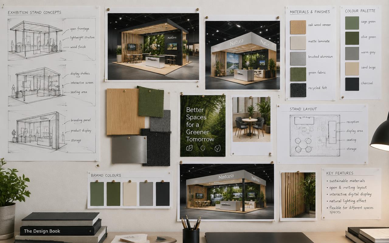
Why most stalls get walked past
A visitor walking an exhibition aisle makes a decision about your stand in the time it takes to pass it. They are not reading. They are scanning for something that is taller than eye level, brighter than the hall, or clearly happening. If your stand offers none of those, it is wallpaper, no matter how good the graphics are.
That is the whole design problem, and it has three parts: be seen from a distance, be understood at ten metres, and be enterable at two. The twenty-five ideas below are organised in that order, because solving them out of order is what produces a beautiful stand with nobody in it.
Ideas 1 to 6: be seen from across the hall
Visibility is almost entirely vertical. Floor-level branding disappears behind the first row of people who stop at your neighbour's stand, so the things that carry across a hall are the things above two and a half metres — hanging banners, towers, illuminated edges and silhouette.
Check the organiser's rulebook before committing to any of these. Height limits, rigging points and whether hanging is permitted at all vary by hall, and a concept that breaks the limit is rejected after you have paid for it rather than before.
- 1. Hang a circular or square banner above the stand so the brand reads from four directions
- 2. Build a brand tower at the corner nearest the main aisle, not in the middle of the stand
- 3. Light the top edge of the fascia so the outline survives a bright hall
- 4. Use one saturated brand colour across a whole elevation instead of a logo on white
- 5. Keep the logo at the highest permitted point and the message lower, where it can be read
- 6. Give the stand a recognisable silhouette — an arch, a curve, a cantilever — so it is remembered by shape
Ideas 7 to 12: open the stand up
The single most common mistake in Indian halls is a counter placed across the open side. It reads as a shop till, and it tells a visitor that entering means being sold to. Pull the counter back or turn it ninety degrees and the same stand gains footfall without changing anything else.
Corner and island positions are worth paying more for, but only if you treat the extra open sides as entrances. Walling off two sides of a three-side-open stand throws away exactly what you paid the organiser extra for.
- 7. Set the reception counter back from the aisle line, or rotate it to face inward
- 8. Leave the corner of a corner stall completely open rather than wrapping it in a wall
- 9. Keep an island stand walkable straight through from at least two directions
- 10. Put the hero product on the aisle line so people stop before they commit to entering
- 11. Use a change of flooring rather than a wall to mark where the stand begins
- 12. Keep sightlines from the aisle to the back wall clear, so the stand looks deeper than it is
Ideas 13 to 18: give people a reason to stop
People stop for other people. Any mechanic that creates a small, visible cluster of visitors on your stand will bring more visitors, which is why a live demonstration running on a timed loop outperforms a continuously available one — it produces a crowd rather than a trickle.
Choose one mechanic and commit to it. Three competing attractions on a 24 sq.m stand produce a confused space in which nothing is clearly the main event, and your staff end up explaining the layout instead of the product.
- 13. Run a live demonstration on a fixed schedule and put the timings on the fascia
- 14. Build one working station where the product is actually used rather than displayed
- 15. Give visitors something to do with their hands — assemble, test, try, taste
- 16. Create a photo moment that includes the brand, so visitors distribute it for you
- 17. Serve coffee or cold water from a counter that is open to the aisle
- 18. Run a short screen loop with no sound that still makes sense, since the hall will be loud
Exhibiting soon? Let's build your stall.
Ideas 19 to 25: the details that finish a stand
The last seven ideas are the ones exhibitors skip under time pressure and then regret at handover. Storage, lighting count and cable management are not glamorous, but they are the difference between a stand that looks like the render on day one and a stand that looks like a storeroom by day two.
Lighting deserves special attention. Halls are lit for safety, not for display, and that general light is flat and slightly green. A stand with its own warm, directional lighting looks finished; a stand relying on the hall looks like it is waiting to be finished.
- 19. Plan lockable storage from the first sketch, not after the layout is fixed
- 20. Over-specify spotlights rather than under-specify them; hall lighting is flat and unflattering
- 21. Backlight one panel so there is a bright surface in the stand at all times
- 22. Hide every cable in the platform, the wall cavity or a trunking run
- 23. Keep text on graphics short enough to read while walking past
- 24. Design somewhere for staff to put bags, charge phones and keep water out of sight
- 25. Specify a floor finish that survives three days of traffic without showing scuffs
Matching the idea to the stall size
Not every idea belongs on every stand. A 9 sq.m shell upgrade cannot carry a demo stage and a meeting room; trying to fit both produces a stand where neither works. The table below maps the realistic ambition for each common size.
The display figures come from the same planning ratios we use everywhere: storage at 10% of the area up to 18 sq.m and 15% above, a meeting corner at 5%, and the remainder as display. They are a useful reality check on any concept.
| Stall size | Display area | What fits comfortably | What to leave out |
|---|---|---|---|
| 9 sq.m | 7.65 sq.m | One hero product, a backlit wall, two staff | Seating, meeting area, any stage |
| 12 sq.m | 10.2 sq.m | Product wall, a screen, a small counter | Closed rooms, demo audiences |
| 18 sq.m | 15.3 sq.m | Hero plinth, demo counter, hidden storage | A second attraction |
| 24 sq.m | 19.2 sq.m | Demo station, seating corner, brand tower | Double-height elements |
| 36 sq.m | 28.8 sq.m | Scheduled demo, meeting corner, large graphic wall | Three separate zones |
| 54 sq.m | 43.2 sq.m | Closed meeting room, demo stage, lounge | Nothing much — this size carries most ideas |
| 72 sq.m | 57.6 sq.m | Multiple zones, hanging structure, café counter | Anything that fragments the sightlines |
| 100 sq.m | 80 sq.m | A full visitor journey with a defined route | Leaving the centre of the plan empty |
Turning an idea into a buildable design
Ideas become stands through drawings, and drawings get rejected for predictable reasons: an element taller than the hall permits, a hanging structure where there are no rigging points, an electrical load above what the organiser sanctioned, or a material with no fire-retardant certificate.
So the sequence is worth respecting. Fix the layout first, because changing circulation on paper is free and changing it in the workshop is not. Then settle the finish level. Then design the lighting. Graphics come last, when the surfaces they sit on have real dimensions.
Allow three weeks of build time from sign-off for a stand up to 18 sq.m, four from 24 sq.m and five from 54 sq.m. An idea approved inside that window gets built properly; the same idea approved a week before the show gets built in a hurry, and it shows.
Exhibiting soon? Let's build your stall.